UX Redesign: The Public Transport Website (TPER)
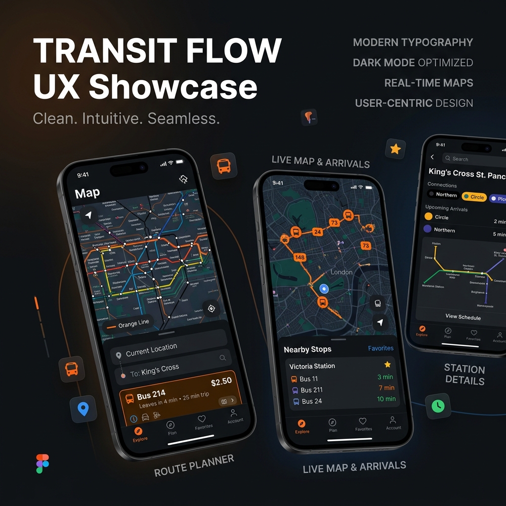
Project Brief: Redesigning the user experience of the local transport portal (TPER), with the primary goal of simplifying timetable search and ticket purchasing from mobile, applying the Double Diamond methodology.
The Starting Point (Disastrous)
What happens when a vital service like public transport has an unusable website? Frustration, delays, and endless calls to the call center. The original TPER website had a System Usability Scale (SUS) of 37.5 out of 100. Global passing grade is 68. Task completion rates (e.g., finding a route or buying a ticket) stuck at 40%. A disaster.
The Method: Double Diamond
"Changing the colors" was not enough. I applied the structured Double Diamond process: *Discover, Define, Develop, Deliver*.
1. Discover: Field interviews and Journey Mapping revealed ruthless truths. Incomprehensible navigation, bureaucratic technical jargon, and a virtually non-existent mobile experience. 2. Define: I synthesized the chaos into clear *problem statements*, creating personas representative of the average commuter and confused tourist. 3. Develop: From low-fidelity wireframing to fast iterative testing with real users. 4. Deliver: High-fidelity prototypes merged into a clean and scalable Design System.
Field Results
The numbers speak for themselves and justify the investment in UX Design:
| Metric | Before Redesign | After Redesign |
|---|---|---|
| System Usability Scale (SUS) | 37.5 (Severe Failure) | 72.5 (Good/Excellent) |
| Task Completion Rate | ~40% | >90% |
| Time on Task | High (Frustration) | Very Low (Fast flow) |
*Table 1: KPI comparison pre and post redesign*
View the [Interactive Prototype on Figma](https://figma.com/).
The human-centered approach transformed a bureaucratic labyrinth into a modern and efficient digital hub.