Apache Superset chart plugins
Five custom visualization plugins for Superset 6: a hierarchical table with rollups, a calendar cross filter, a bar chart with benchmarks, a heatmap with totals and a KPI comparison card.
- Role
- Author
- When
- July 2026 to present
- Stack
- TypeScript, React, Apache ECharts, Jest, PowerShell
Context
Superset ships with a large catalogue of charts, but healthcare reporting keeps asking for the same few things the built in charts do not cover well: tables that roll up from department to hospital to region, comparisons against last year or a budget, and filters that read like a calendar. Superset lets you add new chart types as frontend plugins, so I built the ones I kept missing.
All five follow the same structure as Superset's own plugins: a buildQuery that turns the chart's form data into an API request, a transformProps that shapes the result, a control panel for the Explore view and a React component that renders it. They all support dashboard cross filtering through Superset's setDataMask API.
The plugins
Hierarchical table. The largest of the five. It renders a tree table or a pivot matrix from either several grouping columns (region, hospital, ward) or a parent and child ID pair. Subtotals and a grand total are computed by walking the tree after the query, with an explicit aggregation per metric: sum, mean, distinct count or ratio. Ratios matter here: a percentage at department level has to be recomputed as a ratio of sums, not averaged. Other features came straight from health reporting needs: Wilson and Poisson confidence intervals on ratios, and small number suppression that hides low counts (and the complementary cells that would reveal them) so a published table cannot identify individuals.
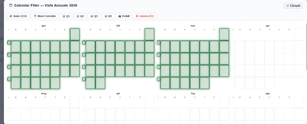
Calendar filter. A calendar heatmap that doubles as a dashboard filter: click a day, a week or a month and the other charts on the dashboard filter to that period.
StratumBar. An extension of the standard bar chart with a benchmark line (fixed value, average, median or a target column), percentage variance badges against that benchmark, a secondary axis and a toolbar that lets dashboard viewers switch layout without opening the chart editor. Variance colours can be inverted for metrics where lower is better, such as waiting times.
StratumHeatmap. A two dimensional heatmap, typically day of week by hour of day, with row, column and grand totals that can themselves be clicked to filter. Text colour inside each cell is picked from the background to keep enough contrast.
KPI comparison card. A single number card that shows a current value, a comparison value (previous period, budget or a time shift computed by Superset), the absolute and percentage difference, and a small SVG sparkline.
Engineering notes
Each repository has a Jest test suite for the data transformations (rollups, benchmark maths, variance calculations); the hierarchical table and the calendar filter also run their tests and type checks in GitHub Actions. Installing a plugin into Superset means copying it into the frontend source tree and registering it in MainPreset.ts, which is easy to get wrong by hand, so each repository includes a PowerShell installer that checks dependencies, builds the plugin, backs up the preset file and registers the plugin idempotently.